All works
In active development

Matr Studio
Building a structured learning ecosystem and infrastructure for curated design education
Owolabi Joshua

Note: This project is in active development
TL;DR: This is a walkthrough of how our design and engineering team built Matr Studio—turning scattered, free web resources into structured, open-source learning paths and a collaborative resource library. Working closely alongside a second product designer and a developer, I focused on the end-to-end UX architecture and product design: mapping out platform user journeys, designing context-aware home dashboards, defining flexible lesson flows, and establishing granular profile privacy controls. By bridging our FigJam user maps directly with high-fidelity screens, we eliminated the need for complex handoff documents or verbal walkthroughs of states, animations, and flows. Adapting Radian UI as our design system foundation further ensured a calm, highly functional workspace that makes self-directed design education feel rigorous and seamless.
The Genesis: Why Matr Studio?
When our team set out to build Matr Studio, the core problem was painfully obvious: there are thousands of incredible, free design resources scattered across the web, but learners waste countless hours trying to figure out what order to study them in, how to vet them, and how to track their progress.
The goal wasn't to build another bloated course platform with rigid video players and forced quizzes. Instead, we wanted to build a clean, open-source learning platform centered around seven foundational paths covering brand, product, UI/UX, social media, SEO, design systems, and dev handoff.
To bring this to life, our workflow was split across clear operational chapters:
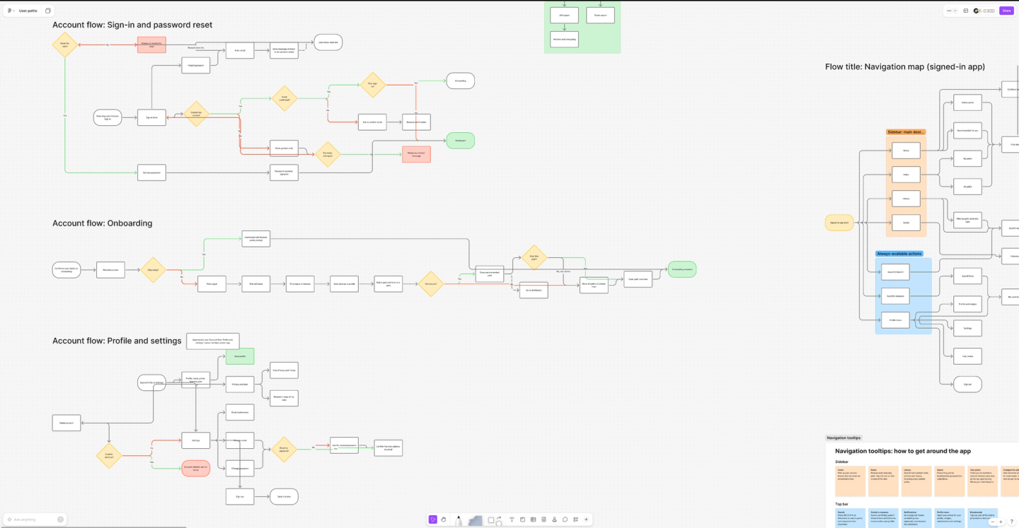
- 1.The Architecture & Unified Hand-off (The FigJam Foundation): Collaborating as a design team to map out every single screen, edge case, and state machine directly within our FigJam user maps—building a living reference where flows, transitions, and CTA actions were baked straight into the layout.
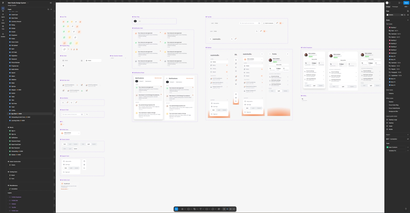
- 1.Systemizing the Interface & Implementation: Adapting Radian UI to fit a content-heavy learning platform, designing custom components for edge cases, and partnering directly with our developer to translate the visual system cleanly into code.
Chapter 1: Mapping the Ecosystem & Streamlining Handoff
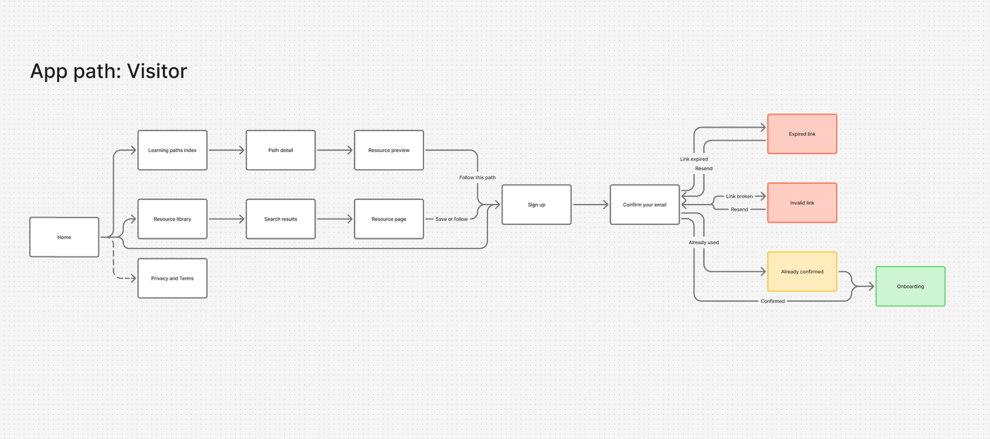
Before pushing a single pixel in Figma, we mapped the entire platform architecture on a FigJam board to establish the core user journeys for launch:
- •The Visitor: Arriving from search or social, browsing paths, previewing the first resource, and transitioning smoothly into account creation.
- •The Beginner Learner: Setting onboarding goals and skill levels, following
- •recommended paths, marking resources done, and earning completion badges.
- •The Working Professional: Using the platform as a utility tool—filtering the library by type, level, or topic to find a specific article, tool, or video instantly.
- •The Content Curator (Admin): Vetting user-submitted resources, checking link health, and publishing entries into paths.
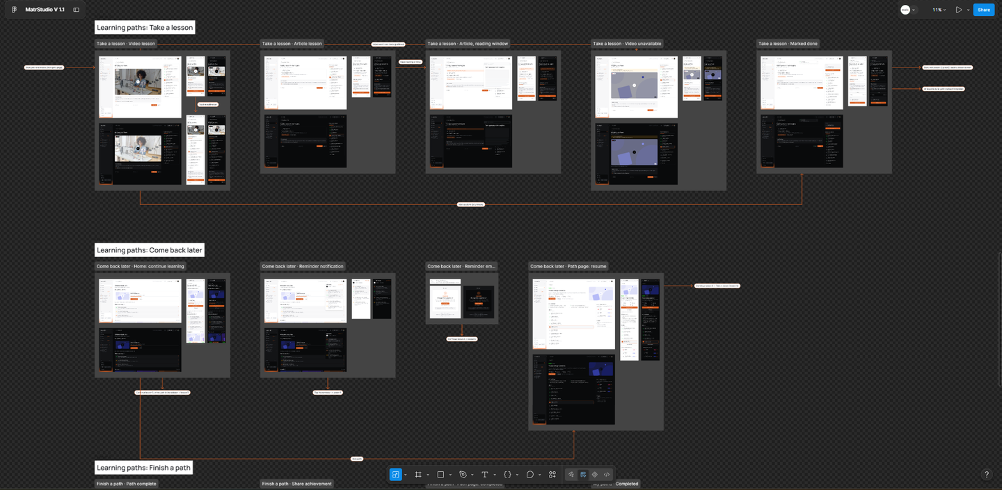
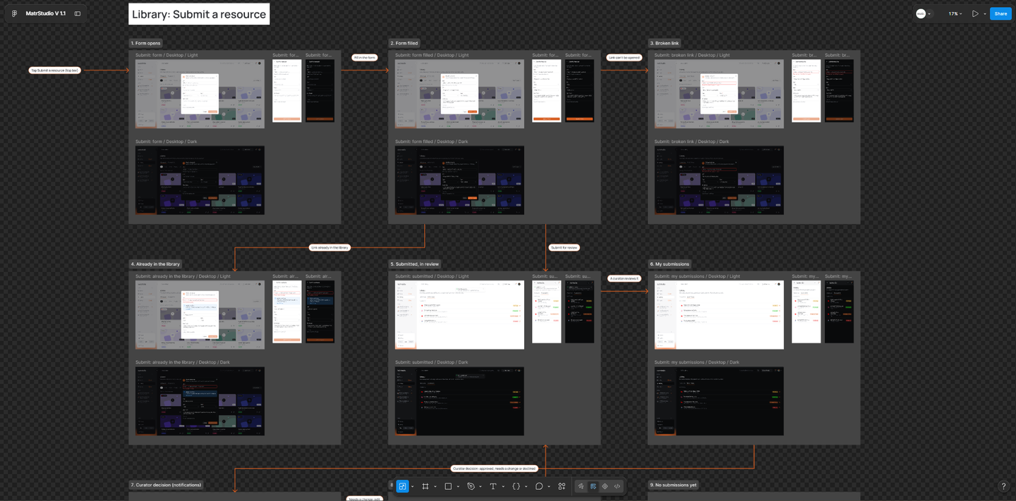
The Handoff Innovation: Rather than writing dense documentation or scheduling repetitive walkthroughs to explain animations, transitions, and CTA actions, we innovated our workflow by mapping the high-fidelity screens directly into our FigJam user paths. By embedding the actual interface frames into the flow maps, anyone on the team could open the file and instantly trace how screens transition from one action to the next. We also designed a resilient App Shell and Navigation Map to ensure users never get lost. Whether on wide desktop screens (using a full sidebar), narrower viewports (collapsing to an icon rail), or mobile web (using a sticky top bar and slide-out drawers), core actions like universal search (Cmd+K), resource submissions, notifications, and profile menus remained universally accessible.
Chapter 2: Designing Dynamic Product States
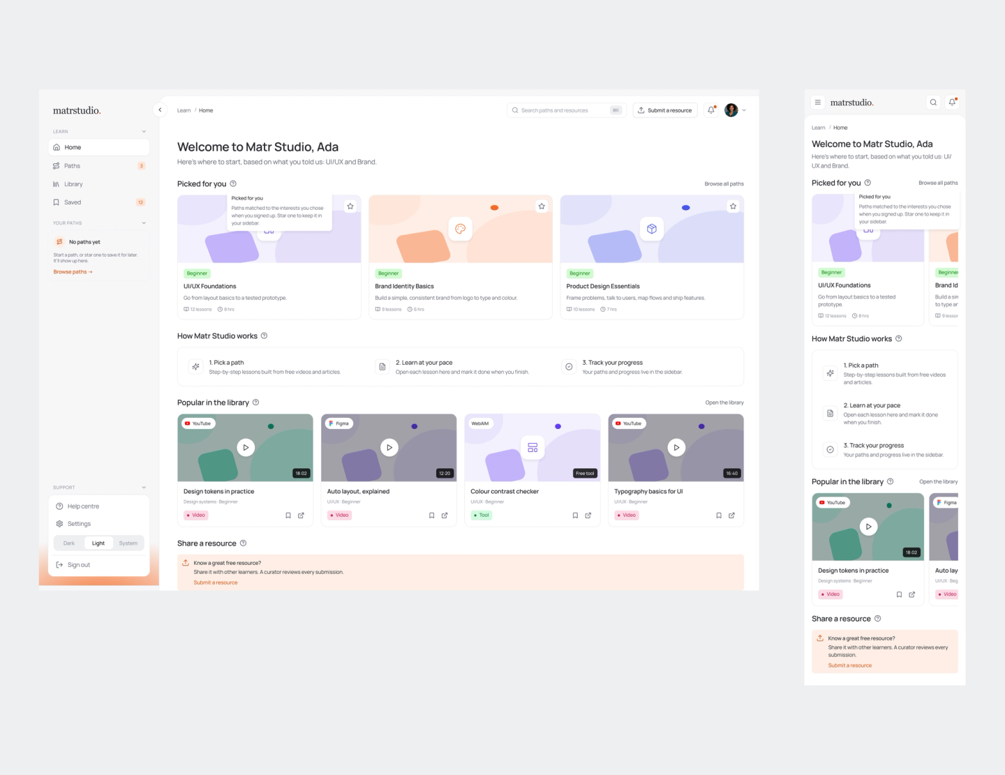
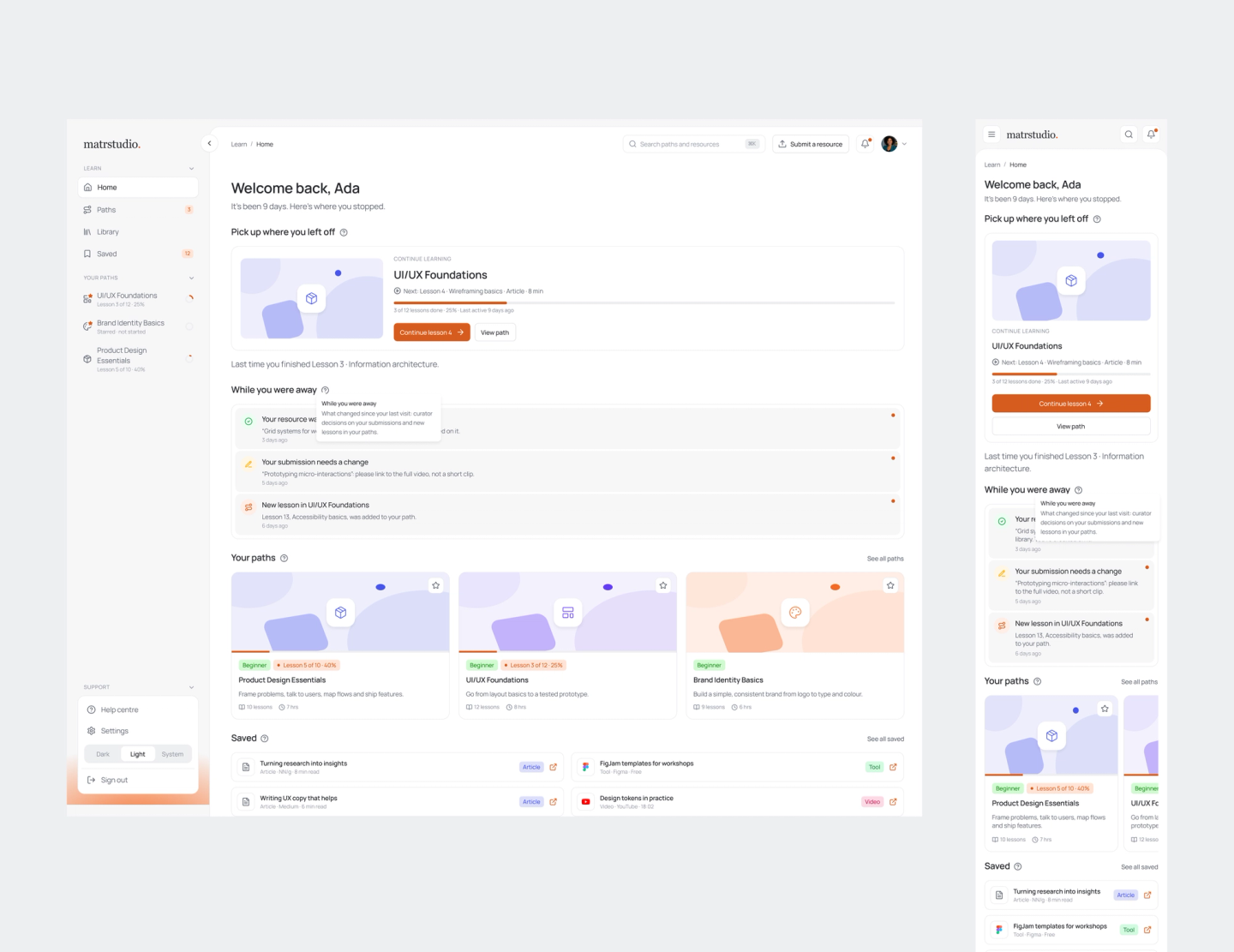
One of the biggest UX challenges was making a self-directed learning app feel responsive to the user's current standing. Rather than treating the product as a static dashboard, I designed four distinct, adaptive states for the Home screen (H1–H5) that automatically reconfigure modules based on lifecycle triggers:
- •New Account (H2): Welcoming first-time users, prompting them to pick their first path, and showcasing top library picks.
- •Learning in Progress (H3): Surfacing immediate "Continue Learning" action blocks, starred paths, and customized recommendations.
- •Welcome Back (H4): Re-engaging users who have been away for 7+ days with a clear resume point and a quick recap of what they missed.
- •Path Finished (H5): Celebrating completion with summary stats, badge rewards, and next-path trajectories.
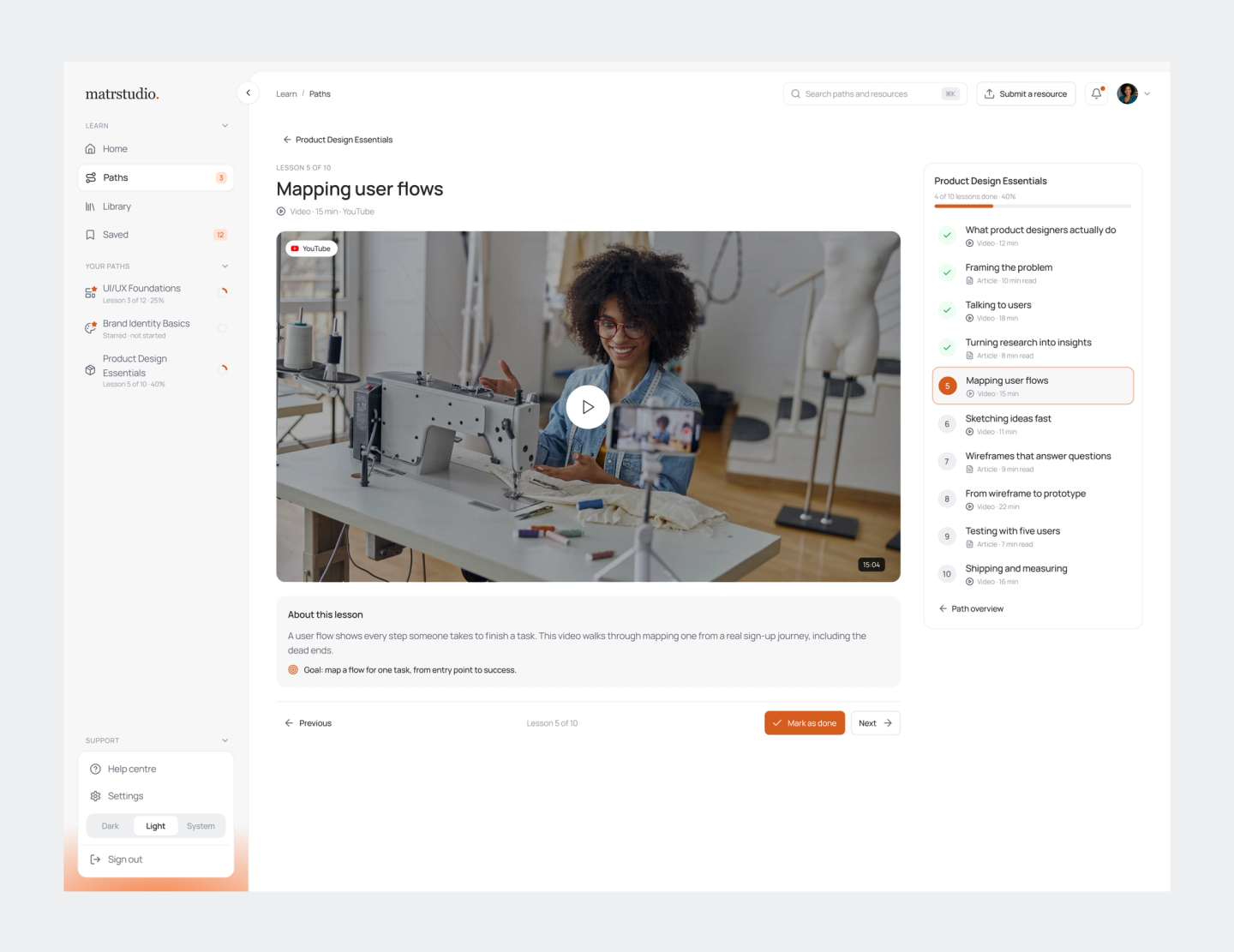
We also designed flexible lesson architecture. Unlike traditional LMS platforms that lock modules sequentially, Matr Studio’s open-source paths allow learners to open and mark any lesson done in any order, complete with progress rings, broken-link reporting, and backup resource fallbacks.
Chapter 3: Adapting Radian UI & Crafting Custom Components
Rather than building a design system from scratch, our design team leveraged Radian UI as our foundational component library. However, adapting a base system to fit a specialized learning and resource platform required deliberate extensions. Where stock components fell short, I designed custom patterns from the ground up, working closely with our developer to establish clean component specifications:
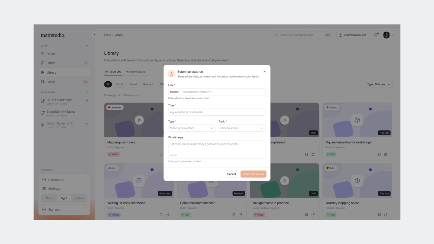
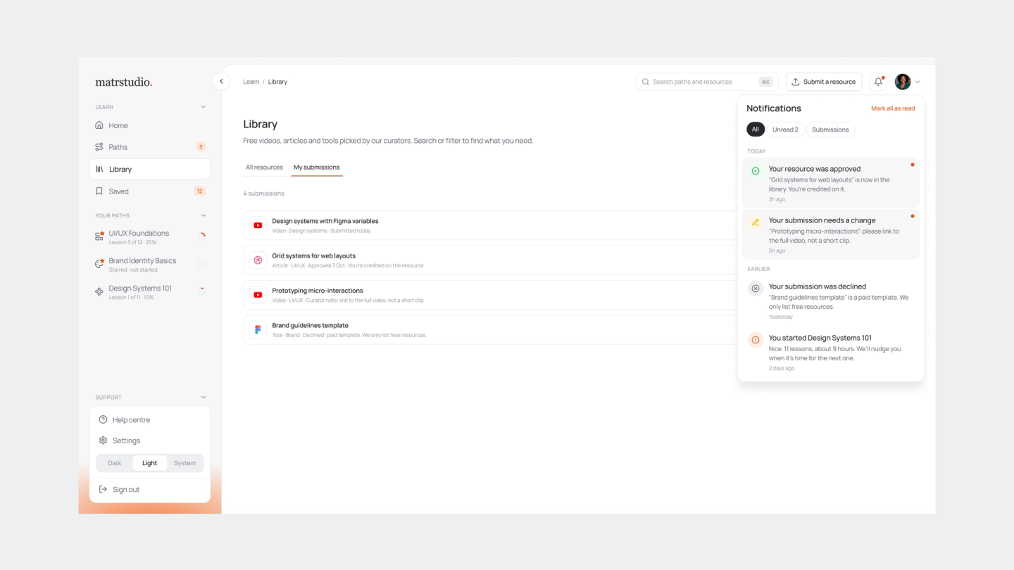
- •The Resource Submission & Review Loop: Designing an intuitive multi-step form for users to submit external resources (with links, titles, types, and topics), paired with status tracking screens (In review, Approved with contributor credit, Changes requested, or Declined with a reason).
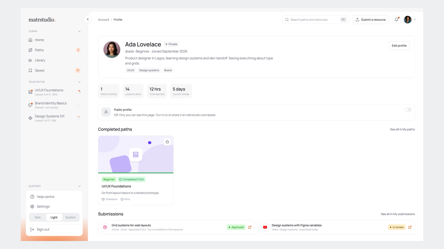
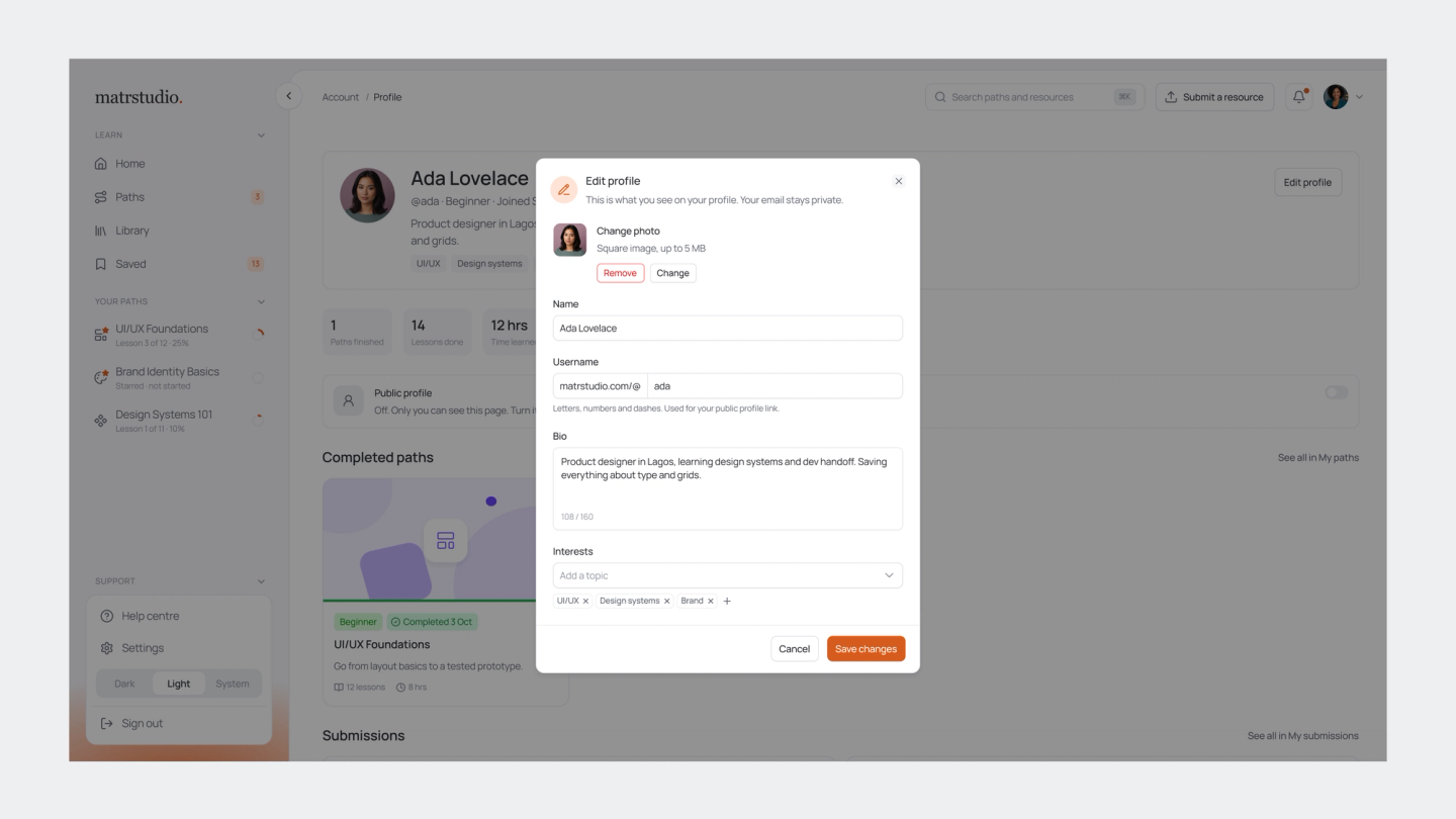
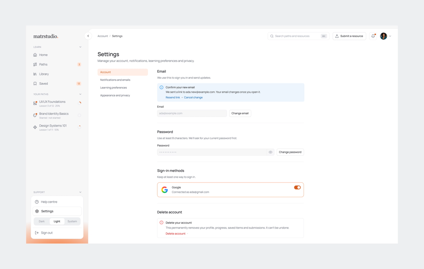
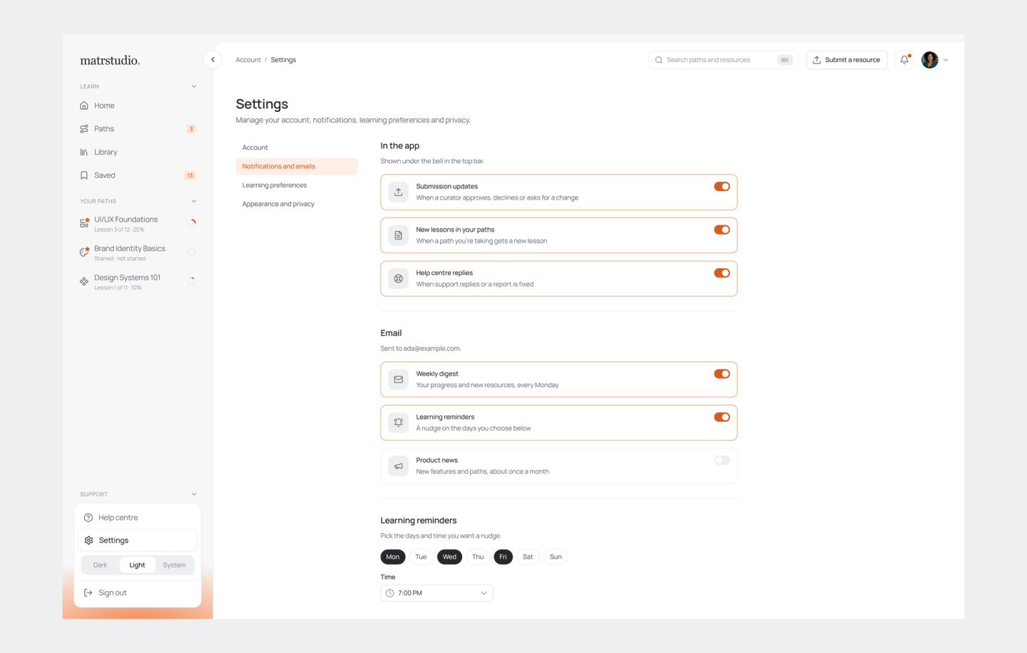
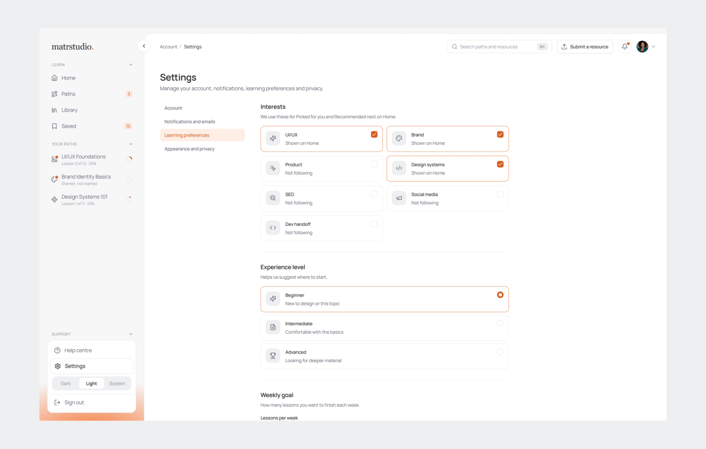
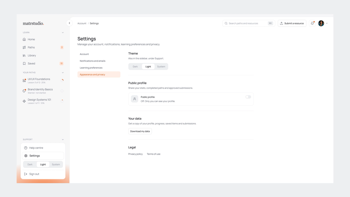
- •Granular Profile & Privacy Controls (P1–P4): Building out private-by-default profiles ([matrstudio.com/@username](<https://matrstudio.com/@username>)) with toggleable public views. This allows learners to selectively expose their stats, completed paths, and approved submissions while ensuring sensitive data (emails, saved items, and in-progress paths) remains entirely private.
- •The Help Centre & Ticketing System: Consolidating support, bug reporting, and request tracking into a single unified interface where users can monitor open/resolved issues and receive context-prefilled bug reports directly from broken lessons or resource pages.
Profile Settings
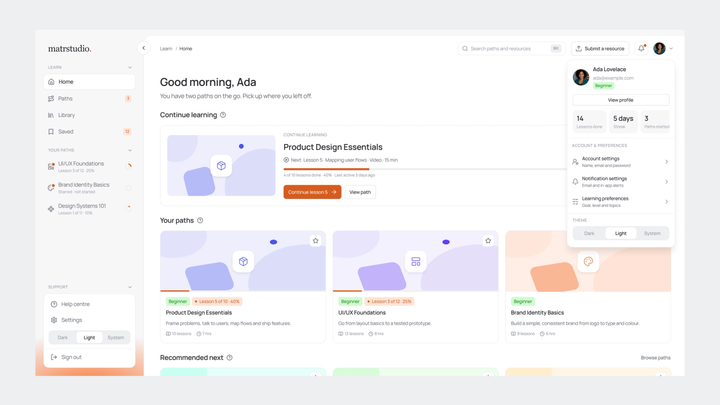
Privacy Settings
Reflections & Takeaways
Designing Matr Studio alongside a collaborative design and engineering team reinforced a vital lesson: structure is the ultimate user experience. When you are dealing with open-source, decentralized content, the design's job isn't to restrict the user, but to provide a calm, predictable framework that brings clarity to chaos. By unifying our FigJam user maps with high-fidelity screen layouts, we eliminated communication friction and kept our developer aligned without bloated documentation. Combined with a thoughtfully extended Radian UI system handling community curation and modular profiles, our team built a foundation that makes self-directed design education feel effortless. It proved how tight cross-functional collaboration and visual systems thinking can turn an ambitious, content-heavy vision into a cohesive, production-ready reality.